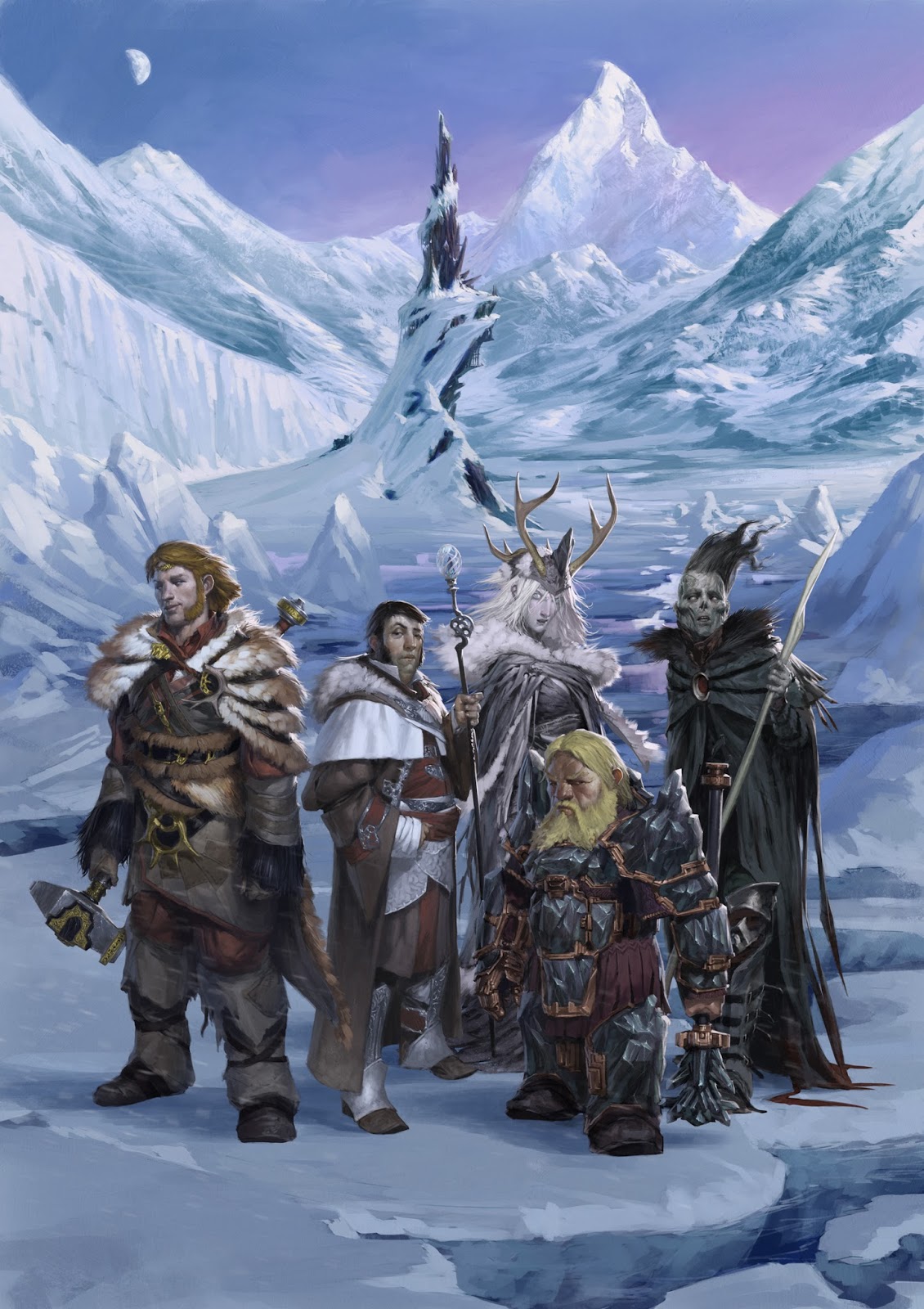
I wanted to show how the packaging came into play on these pieces because I don't often get to see the final result until well after these items are in stores. The graphic design work and logo placement on all these really made them come to life. One thing to note is that a lot of the time, especially on covers like this, a good amount of the work will get covered up or cropped out. The client will ask for that extra bleed so that they have a good amount of space to work with for placement.
Each booklet for these adventures contained foldouts highlighting the characters. This meant all the characters need to be fully painted and on their own layers in the final file. Here is how some of that looked.
This was a really great set of pieces to work on with lots of fun and interesting characters to develop. I really had a blast and its great to finally see them all in print.
I should have a few more things relating to the Sundering around the corner so stay tuned.


No comments:
Post a Comment