
I thought I'd start a series of posts on a piece I began today. There is no rhyme or reason to the piece - I often plan out personal work as something that may evolve into a cover illustration. That is the only condition I have at the moment.
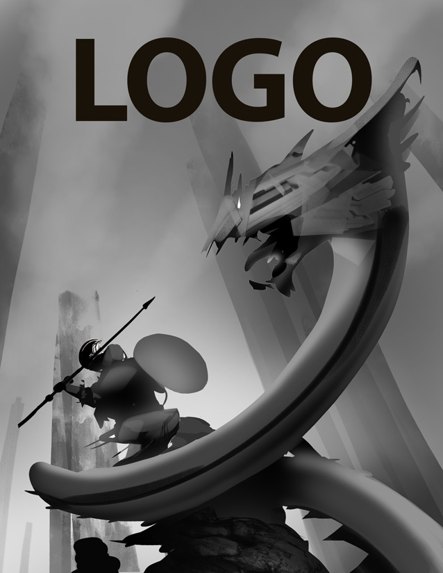
After some random doodling, I start to realize the silhouette of the main character. I chose to work in a large round shield and a weapon (often just a quick slash or line to begin) to add some interest. Then I start out on the foe - and my stream of thought brought me a dragon centipede worm thing...
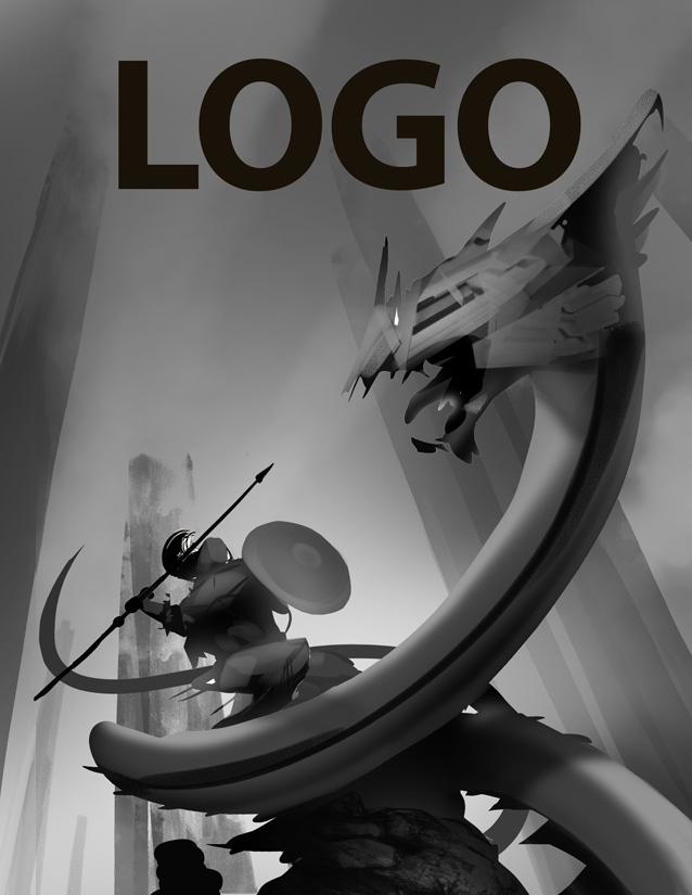
As I'm cobbling this together, I'll keep in mind how the eye will move around the piece and will continue to make corrections as I proceed to make sure I feel I have a strong path for the eye.

Next step, roughing in some form. A second pass to add interest - early on I've decided that I want the dragon head to have a chiseled bone type feel. The action will be taking place atop a rocky peak.

But what about the background? Well for this piece I already know the background will be treated as an atmospheric or very vague story element. There won't be a lot to it likely, my interest and focus is the battle. I've used the background here to add an interesting perspective - I also like the juxtoposition of the straight spires verses the sweeping curves of the dragonwormpede thing...
I'll spend some time throwing out some more ideas for motion and tweaking composition.
From here I'll move to experiment in color, sometimes new elements are introduced at this point with the rough color sparking ideas. I've already set in my mind that the warrior will have some plate armor of some sort, my main concern are the areas I want to put across in vivid splashes of color.
 Once I've settled on the main color elements, I'll move into some secondary color elements on the warrior... though that I'll leave for next time. Its past my bed time :-D
Awesome look at the process you go through, starting off a piece! (Though I'm not sure who's posting this up. I think we have to log in to mark who's posting what?) I'm a big sucker for the red-blue scheme at the bottom-right. Just my humble opinion. :)
ReplyDeleteVery nice.
ReplyDeleteIt's awesome seeing how this piece has progressed from the silhouette. I second Adam as well, I love the red/blue color scheme. It makes your "dragon centipede worm thing" (that's the scientific name right? =P really pop!
ReplyDeleteSorry peoples there seems to be a problem with my account and its posting as unknown - should read me, Kieran :-D
ReplyDeleteOkay fixed! I'm leaning toward the yellow/jade or red scheme at the moment. The red version definitely pops more but I love the retro spacey feel of the jade version.
ReplyDeleteGreat to see some process! Maybe if Frazetta was 25 today, he'd be illustrating like this... :)
ReplyDeleteNow that you mention the retro connection to the yellow / jade, I'm kind of inclined to agree with you. It does shake it up a bit from the James Jean esque palette that's all over now.
ReplyDeleteVery cool! It's fascinating to see such a methodical approach. I tend to be really sloppy in the initial stages, and spend a lot of time cleaning up the image by the end. I love how crystal clear your process is.
ReplyDeleteReally cool approach! I admit at first I was a fan of the red dragon color study, but after looking at this post a few times, I've switched to the jade ;) You've convinced me! haha! Really awesome post, man.
ReplyDeleteVery cool, Kieran !! Brilliant rock texture thrown in right away, and great way to lock down solid movement by ways of silhouette.. Sorta forces you into thinking in terms of brevity of lines and strokes from the beginning..
ReplyDeleteCan't help but think of Roger & Martin Dean in both color and design of the dragon.. Love it!!
Chuck